Fun with axes, folks.
The first thing you learn when dealing with charts is to always, always look at the axes.
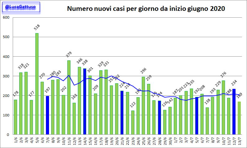
Here is the “scary, we’re teetering on the brink of a second wave, oh my gosh we keep breaking through the 7-day moving average!!” version of the chart of “new cases per day” for the entire country of Italy. There were 169 total “new cases” in the entire country, population 65,000,000 today. Not one hundred sixty-nine thousand. 169. As in thirteen times thirteen.

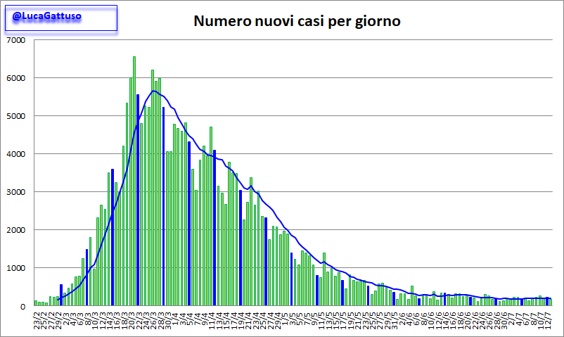
Now, here’s the chart with the x-axis expanded back to February:

Like I’ve said from the beginning: it’s a seasonal cold. Just exactly like every other year. Temps up, humidity up, herd immunity. Aaaaaand… it’s over. No sniffles til October.
The difference this year was the media and government incited panic, the coding of every dead body that had coughed or sneezed within a month of dying as “Covid”, and, of course, murder by ventilator.
By the way, daily CoronaCold deaths in Italy (“with, not from!”) are running at about ten per day, most in Lombardy, specifically the two cities of Brescia and Bergamo. The working theory is that these two cities received something sinister in their batches of 2019 flu vaccine that set elderly people up for a fall. It wouldn’t surprise me at all. SOMETHING very specific happened in those two cities.
But again, in a nation of 65,000,000 that has an average of 1900 deaths per day just organically, they’re only finding ten deaths per day to even call “Covid”. And Italy appears to be mostly reopened. Except to American tourists, that is!
